Reports
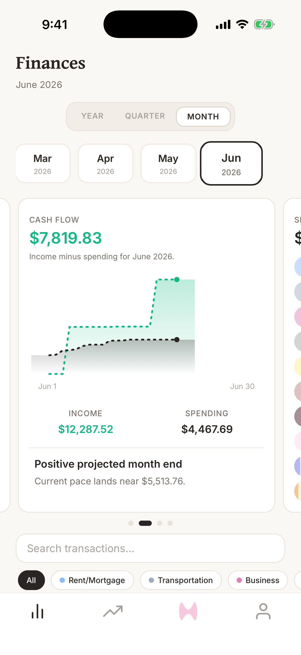
How do I read the Cash Flow graph?
Understand the Cash Flow graph on the Finance AI home screen, including income, spending, and projected cash flow.
Quick answer
The Cash Flow graph shows income minus spending for the selected period. Green income and dark spending lines build across the month, and the headline number shows whether you are currently positive or negative.
Steps
- 1Open Finance AI on your iPhone.
- 2Go to the home screen.
- 3Swipe the graph carousel until you see Cash Flow.
- 4Read the headline number as income minus spending for the selected period.
- 5Compare the Income and Spending totals below the chart.
- 6Press and drag across the chart to inspect cash flow through an earlier day in the period.
What the graph means
Cash Flow is income minus spending for the selected period. A positive number means income is ahead of spending. A negative number means spending is ahead of income.
The chart builds day by day during the month. The income line rises when income transactions post, while the spending line rises as spending transactions post.
How projections work
When Finance AI has enough activity in the selected period, it estimates where cash flow may land by the end of the period based on the current pace.
Projection language is directional. It helps you spot whether the month is pacing positive or negative, but it can change quickly after payroll, rent, large purchases, refunds, or corrected transaction dates.
Why the graph may look wrong
Cash Flow depends on transaction dates, categories, and whether a transaction is income, spending, or a transfer. If the chart looks off, check recent transactions first.
- Change the transaction date if a transaction posted in the wrong month.
- Change the category if income, spending, or transfer activity is being counted incorrectly.
- Wait for pending bank activity to finish syncing if a recent transaction is missing.